The Look of the Book:
How Design and Layout Influences the Reading Experience
by WLT Intern, Eloise Kirn.
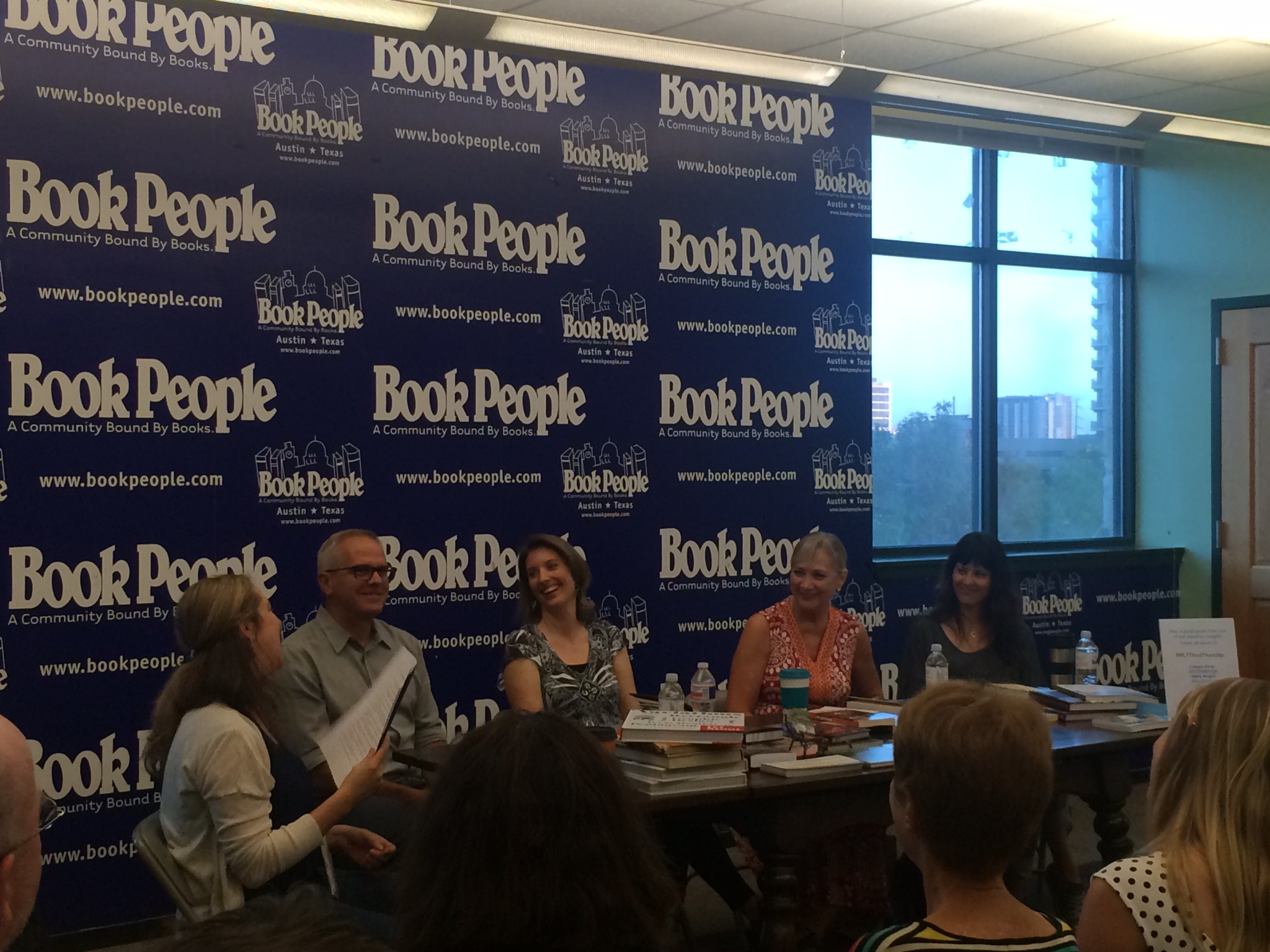
On Thursday, September 17, 2015, the Writers’ League of Texas enlisted four graphic designers to debunk the age-old myth that readers should never judge a book by its cover. “A book cover is like an interview outfit,” founder of TLC Graphics and award-winning book designer Tamara Dever said. “If you don’t take your cover seriously, how can you expect your readers to take you seriously?”
The message of the evening: If readers care about cover design, you should too.
So, how does an author put his or her best foot forward and dress the part? How graphic artists design a salable book? Our panelists, Tamara Dever, Shelia Parr, Kathy Sargent and DJ Stout, brought their diverse expertise to the conversation, discussing how the elusive elements of book design can be boiled down to a replicable skill. “People aren’t aware of why they like what they do. But there’s a hidden architecture,” Stout said. “Layout is the great skill of a publication designer, and it’s a learned behavior.” While the panel discussion covered a variety of topics, the overarching theme was examining what these learned techniques are. In short, the group agreed that an effective book cover will:
- Match the genre. The typography of a textbook varies drastically from that of a children’s book or a thriller. Knowing the standards of each genre and following these proven-to-sell nuances inform and engage your target audience. Failure to comply with industry standards can result in potential readers misinterpreting the content and overlooking your book. For example, Parr discussed how genre appropriateness can be especially important when a book straddles multiple genres, like business and self-help. Using the design of a business book, in this case, might boost sales by attracting readers who wouldn’t usually venture into self-help.
- Engage. Short title. Visually appealing. Reflects the content. “A cover has to grab attention immediately, within 3-5 seconds. It’s like a billboard. Each piece of the cover has its own purpose, the back is more like an advertisement, but once you get on the inside, the purpose of the design is to get you to read it,” Dever said. The designers all agreed that while catching a reader’s attention with the cover is imperative, so is maintaining their interest with the interior. Stout added, “A book is like a movie: you go from page to page to page. If all the pages are the same, it gets very boring. There needs to be a structure and pauses and the beginnings of the chapters, changes of scale, breathing room. If everything looks the same then there’s a lack of visual hierarchy.”
- Communicate. Effective book covers catch the reader’s eye and tell a story. “It doesn’t matter how good your magazine or your book looks,” Stout said. “If it doesn’t communicate, if it doesn’t work with real content—and that content can be writing and typography and photography all working together—but if there’s not real content there, if it’s not saying something vital to whoever your constituency is, then that’s just decoration.” A book design should reflect what lies between its pages: subject, tone and genre, among others.
- Brand. Not only should you book brand itself as part of a larger genre, but it should create its own, recognizable trademark. “Once you decide on your cover, that’s your logo, your identity, your ad,” said Stout. The panelists were adamant that a book should maintain the same cover across all mediums as well: print, e-book, marketing collateral, etc. Sargent was concentrating on the e-book promotion of her first novel, when she realized the true importance of an intriguing, thought-provoking cover online, “It’s counter-intuitive because it’s even more important when you’re selling e-books to have a good cover […] You get very little other information about the book. It’s the cover, the cover, the cover.” The panelists stated the print and e-book covers must be the same, however. Brand recognition is key to sales.
- Sell. “First and foremost this is about selling products,” said Dever. In order to sell, a cover has to attract the attention of a reader, engage them in opening the book, then hook them with an inside design that is approachable. Often the sell happens after this browse on the inside. So the panelists each pointed out aspects of interior design people often fail to consider: spacing between lines, the margins, the difference between chapter title typography and the rest of the text. “You don’t want the interior of the book to be in such dissonance with the text that it’s jarring,” Sargent said. Readers may gravitate toward flashy covers, but they fail to buy if the content doesn’t look easy to process.
Our panelists each brought in books cover designs that demonstrate the ability to stick out in a bookstore and resonate with the reader. Their selections varied greatly in style and genre. Parr spoke to her love for Joan Didion’s The Year of Magical Thinking. On the simple, text-only cover, the letters “J O H N” are bolded. Parr found this symbolism chillingly beautiful, as the book is about the author’s first year after the death of her husband, John. Dever included the children’s book The Mischievians by William Joyce, for its playful text, vibrant colors and clever communication, while Sargent applauded the cover of Love in the Time of Cholera by Gabriel Garcia Marquez. Here Sargent brought up another important aspect of book design, “What’s left out of the cover is as important as what’s in them.” She is drawn toward Gabriel Garcia Marquez’s nod to magical realism and the fantasy his cover sparks. Finally, Stout spoke to The End of the Game by Peter Beard, which is a constant source of inspiration for him with its striking photography, shifting layout scheme and simple typography.


These beautiful covers made us wonder what exactly differentiates graphic design from other of visual arts. The panelists began using the somewhat outdated term ‘commercial art’ to convey the difference on a fundamental level. “Communication. It’s visual communication,” Stout said. “Fine art can have emotions. It can be vital to people. The difference between what we do as publication designers is we are trying to convey content.” The difference is to sell, which has a plethora of its own considerations, other than to simply please. Dever went further to say the process is not artistic as it is scientific, “Authors don’t like [the commercial aspect] because writing is such a beautiful craft, as opposed to making laundry detergent, but a package is a package and its purpose is to communicate what’s inside and also to make you buy it.” When approached by writers, designers are essentially given two problems to solve: 1) How do I visually get people to pick up the book? and 2) How do I visually allow them to digest the text? Dever added, “If it were for decoration only, we could make it as frilly and beautiful and cool looking as possible, but you probably won’t be able to read it.”
While many writers share the panelists enthusiasm for superb book covers, affording a decent graphic designer can often be a challenge. Audience members had questions regarding designing their own self-published books and hiring cheaply. Dever struck to the heart of the matter when she said, “You get what you pay for.” While there are ways to get around spending thousands on a design—such as reaching out to design students or learning online programs—Dever advises, “If you can’t afford a cover, wait to publish your book until you can.” The consensus was that the cover is a books face to the world and it’s worth the investment. Even in the case you are able to get a solid cover image from an inexperienced source, the technical aspects can end up ‘nightmarish.’ Often cheap designers or students don’t know how to set up files for the printer right, so books will return with the completely wrong format. The panelists agreed that it’s more cost effective to spend the money up front then have to redo the entire design a second time.
By the end of the night, we were convinced that book design is both fine art and an integral part of publishing sales; it’s the place imaginations begin and it’s the author’s greatest marketing tool. Like an author’s words, a designer’s graphics must hook and engage.
What do you think? Can you judge a book by its cover after all?
Please join us for our next Third Thursday on October 15th at 7:00PM on the third floor of Book People! Authors Anne Bustard, Greg Levin, Jason Neulander, and Amy Tintera will lead “Write Fright Night! Dealing with Spine-Tingling Writerly Anxieties”, sharing with us their tactics on combating the fears, doubts and insecurities inherent in the writing process.